

A customer reaches your booking form but cannot identify the required fields. Another enlarges your prices and finds that the text overlaps. Someone using a keyboard opens your menu and cannot move beyond it.
These barriers can prevent people from completing everyday tasks on a business website.
Website accessibility means designing and maintaining content so people with disabilities can perceive, navigate, understand, and interact with it. Improvements can also make a website easier to use in other situations, including on smaller screens.
A practical website accessibility checklist for small businesses starts with the tasks customers need to complete: finding information, contacting you, booking a service, signing in, or buying a product.
This checklist draws on W3C accessibility guidance and WCAG 2.2. It provides a starting review, rather than a complete conformance assessment or a guarantee of legal compliance.
What Standard Should Guide Your Checks?
The Web Content Accessibility Guidelines, or WCAG, provide testable accessibility criteria. They organize accessibility around content being perceivable, operable, understandable, and robust.
WCAG has three conformance levels: A, AA, and AAA. WCAG 2.2 Level AA is a useful technical target for planning improvements, although contractual or legal requirements may specify a different version or scope.
Claiming Level AA conformance requires satisfying the applicable Level A and AA criteria across the claimed scope, including complete processes. Passing a short checklist is insufficient. w3.org
A Practical Website Accessibility Checklist for Small Businesses
1. Test Important Tasks With a Keyboard
Set the mouse aside and navigate using your keyboard.
Try Tab to move forward, Shift+Tab to move backward, and the relevant activation keys. Native buttons usually work with Enter or Space; links normally use Enter. Some controls use arrow keys.
Test your navigation, search, contact form, booking flow, login, cart, and checkout.
Look for:
- Interactive controls you cannot reach.
- Focus moving in an unexpected order.
- Dropdowns that work only on hover.
- A visible focus indicator disappearing.
- A control trapping you without a keyboard exit.
Include a working skip link or another suitable way to bypass repeated navigation. W3C’s preliminary checks cover keyboard access and visible focus. W3C
2. Keep Focus Visible Around Popups and Sticky Elements
Focus shows which control will receive keyboard input.
Check whether sticky headers, cookie banners, chat widgets, or promotional panels cover the focused control.
WCAG 2.2’s Focus Not Obscured (Minimum) criterion requires that author-created content not entirely hide a focused component. Keeping the whole component visible is a better practical aim. W3C
For a modal dialog, verify that focus moves appropriately into it, remains within it while the modal is active, and returns sensibly when it closes.
A popup can look polished while still blocking the task behind it.
3. Use Clear Page Titles and Logical Headings
Give each page a meaningful title and a heading describing its purpose.
Use actual heading markup through your editor’s heading controls. Making a paragraph large and bold does not turn it into a heading for assistive technology.
A simple article structure might use:
- H1 for the page topic.
- H2 for main sections.
- H3 for subsections within an H2.
Nest headings according to the content’s relationships. Avoid choosing heading levels simply for their default appearance.
Use meaningful page regions, such as navigation and main content, to support orientation. W3C
4. Make Links and Buttons Understandable
Use text that identifies the destination or action in context.
| Less useful wording | More useful wording |
|---|---|
| Click here | View our delivery options |
| More | Read about bookkeeping services |
| Download | Download the product guide (PDF) |
| Submit | Send your enquiry |
| Unnamed cart icon | An accessible name such as “View cart” |
Icon-only controls need an accessible name. For people using speech input, ensure that a control’s accessible name includes its visible label.
Use links for navigation and buttons for actions such as submitting a form or opening a dialog. Prefer native controls before adding custom behavior. w3.org
5. Check Contrast and Avoid Color-Only Meaning
Text should remain readable against its background.
WCAG Level AA generally requires a contrast ratio of at least:
- 4.5:1 for ordinary text.
- 3:1 for large text.
Under this criterion, large text means at least 18 point, or 14 point bold. Exceptions also apply. W3C
Check actual color combinations with a contrast checker. Pay attention to pale placeholder text, navigation, promotional banners, and text over photographs.
Review important control boundaries and icons too. WCAG’s non-text contrast criterion generally requires 3:1 for relevant visual information needed to identify controls and states, with exceptions. w3.org
Do not communicate an error only by turning a field red. Add a clear message, such as “Enter an email address in the format name@example.com.”
6. Add Image Alternatives Based on Purpose
An image’s alternative text should reflect what it contributes in context.
| Image purpose | Practical approach |
|---|---|
| Informative product photo | Describe relevant visible details |
| Decoration only | Use an empty alternative: alt="" |
| Image acting as a control | Describe the action or destination |
| Complex chart | Provide essential information through nearby text or a detailed alternative |
| Important words inside an image | Provide equivalent accessible text; prefer real text where possible |
For an illustrative product photograph, “Black backpack with a front zipped pocket” may be more useful than “IMG_2048.”
Avoid adding search keywords unrelated to the image. W3C’s image guidance distinguishes informative, decorative, functional, and complex images. W3C
If your blog hero contains the article title, keep that title as real text on the page too. Readers should not depend on words embedded in a picture.
7. Make Forms Clear and Recoverable
Forms often sit at the point where a visitor becomes a customer.
Check that each field has a visible label associated with its input. Placeholder text should not be the only label.
Provide instructions before users need them. Identify required fields in text, explain expected formats, and make errors specific.
For example, replace “Invalid entry” with “Enter your phone number, including the country code.”
Preserve valid entries when someone corrects a mistake. Ensure errors and success messages are available to assistive technology, rather than only displayed visually.
Ask only for information needed to complete the task. W3C
8. Test Text Enlargement and Narrow Layouts
Increase text size and browser zoom. Check whether headings, navigation, forms, and dialogs remain usable.
WCAG’s Resize Text criterion calls for text enlargement to 200% without loss of content or functionality, with specified exceptions. W3C
Reflow is a separate requirement. For ordinary vertically scrolling content, test a width equivalent to 320 CSS pixels without requiring horizontal scrolling to read each line. Content requiring a two-dimensional layout, such as some tables, has exceptions. W3C
A quick 200% zoom check is useful, but it does not fully test reflow.
Watch for clipped prices, overlapping labels, hidden buttons, and fixed-width popups.
9. Give Controls Enough Size and Space
Small, tightly packed controls can be difficult to activate.
Check mobile menus, quantity selectors, close icons, pagination, and adjacent links.
WCAG 2.2 Level AA’s Target Size (Minimum) criterion uses 24 by 24 CSS pixels, with exceptions including specified spacing conditions and inline targets. W3C
For primary buttons, aim for generous size and spacing. Check the full criterion before recording a pass or failure.
10. Provide Accessible Audio and Video
For videos containing meaningful audio, provide accurate captions that include relevant speech and non-speech sounds. Review automatically generated captions before publishing.
Provide transcripts for audio content and consider descriptive transcripts for videos. If important visual information is not conveyed through audio, provide suitable description.
A transcript alone is not a universal replacement for synchronized captions or audio description. Requirements depend on the media and conformance level.
Use a player with accessible controls. W3C
11. Review Moving Content, Sign-In, and Third-Party Tools
Test carousels, animated banners, cookie controls, chat widgets, booking tools, and embedded checkout components.
Check whether users can pause relevant moving content, operate controls with a keyboard, and understand updates.
For sign-in, allow password managers and pasting where appropriate. Provide an accessible route through authentication challenges.
WCAG 2.2 includes requirements addressing accessible authentication and alternatives to dragging actions. w3.org
A theme or plugin choice does not establish that the finished experience is accessible. Test the configured version customers actually use.
Combine Automated Checks With Human Testing
Automated tools can flag problems such as missing accessible names or some contrast failures. They cannot determine every aspect of accessibility.
W3C advises that evaluation tools cannot check all accessibility requirements and need human judgment. W3C
| Method | What it helps assess | Limitation |
|---|---|---|
| Automated scan | Detectable markup and contrast issues | Cannot determine overall accessibility |
| Keyboard review | Reachability, order, focus, and operation | Does not cover all assistive-technology needs |
| Zoom and layout checks | Clipping, overlap, and reflow | Requires testing across relevant components |
| Screen reader testing | Names, structure, reading order, and announcements | Requires knowledge of the tool |
| Testing with disabled users | Barriers in real tasks | Complements technical evaluation |
Include someone experienced with assistive technology when assessing complex journeys. A clean scan is useful evidence, not an accessibility certificate.
What Should a Small Business Fix First?
Prioritize barriers by their effect on customers.
| Priority | Example | Suggested response |
|---|---|---|
| Task blocker | Keyboard users cannot submit a booking | Fix promptly and test the complete task |
| Widespread barrier | Shared navigation lacks usable focus | Correct the common component |
| Content barrier | Product information appears only in an image | Supply equivalent accessible content |
| Recurring publishing problem | New articles use poorly structured headings | Update the publishing process |
This is a suggested work order, not permission to ignore other issues.
Start with representative pages and important journeys: the homepage, a service or product page, contact, booking, login, and checkout. Include error states and mobile layouts.
For each issue, record the page, component, reproduction steps, impact, owner, and retest result.
Keep Accessibility in Routine Website Maintenance
Check accessibility when you publish content, change templates, update plugins, or introduce a new form.
A manageable publishing checklist is:
- Page titles and headings describe the content.
- Links and controls have meaningful names.
- Images have appropriate alternatives.
- Color contrast has been checked.
- Forms have labels and useful errors.
- Keyboard operation and focus have been tested.
- Enlarged text and narrow layouts remain usable.
- Media has the required alternatives.
- Third-party tools have been tested.
- Reported barriers have an owner and follow-up date.
Provide a clearly discoverable way to report accessibility problems. If you publish an accessibility statement, describe your actual status and known limitations accurately.
Frequently Asked Questions
1. Can I check website accessibility myself?
You can perform a valuable first review using keyboard navigation, contrast checks, text enlargement, and content inspection.
A full evaluation requires broader testing and expertise, especially for complex interactions.
2. Does an accessibility plugin make my website compliant?
Installing a plugin does not establish conformance. It may help with particular tasks, but accessibility depends on content, code, configuration, and complete user journeys.
Test the finished site and verify specific claims.
3. Do all images need descriptive alt text?
No. Informative images need appropriate alternatives, while purely decorative images generally use an empty alternative. Functional images should communicate their action or destination.
4. Does passing an automated test mean my website is accessible?
No. Automated tools detect only some problems. Combine them with manual checks, assistive-technology testing, and user feedback.
5. How often should a small business review accessibility?
Build checks into publishing and release work. Recheck important journeys after significant design, plugin, or checkout changes.
Choose a regular review schedule based on how often the website changes and its complexity.
Conclusion
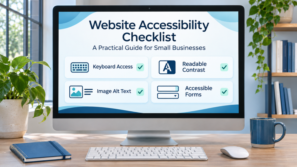
Start with the tasks customers need to complete, then remove the barriers preventing those tasks. Keyboard access, readable content, meaningful image alternatives, and usable forms are practical places to begin.
Use this checklist to guide improvements, keep records of fixes, and retest after changes. Accessibility works best as part of everyday website maintenance, supported by deeper evaluation where needed.